Thanks!
Wednesday, March 19, 2008
Blogger Doesn't Rock!
So I don't know what happened with my movie (below), but I swear it looks a lot better than that. I think it just got butchered by blogger. Does anyone know the best way to upload a video on here? I created it in flash and saved it as a quicktime movie. Any suggestions would really help.
Tuesday, February 12, 2008
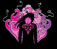
Sagmeister
I looked at all of Sagmeister's work on his site, and I absolutely love it! He is so creative and clever in everything that he does. He uses mediums that wouldn't normally be used in design, which really adds a lot of interest to his work. I really find his unique typographic choices refreshing because I'm starting to feel like there's not really very much room for completely free creative expression in some areas of graphic design (especially typography). It's nice to see that someone who's work is outside the norm is so successful. I also love the fact that he did quite a few Talking Heads and David Byrne album designs. His design sense is very cohesive with David Byrne's music; it's a perfect combination! Check it out: http://www.sagmeister.com/ This is my favorite http://www.sagmeister.com/worknew11.html
Tuesday, February 5, 2008
Lexus Hybrid ad
Has anyone seen the commercial for the new Lexus Hybrid? They use typography as a central theme; it's not about the aesthetic aspects of typography, but it's about the use of letters (particularly the letter "H"). The commercial shows clip after clip of places that you would usually see the letter "H" used (in signs, words, filing, etc.), but the letter is actually missing. Then at the end of the commercial, they claim that all of the H's are in the new hybrid vehicle blah blah blah whatever. I just saw it the other day, and thought that it was pretty interesting and clever. Check this out: http://www.lexus.com/lexushybrids/?s_ocid=30383#/Home/ (hit "replay intro" at the very bottom). I also really like the icons they used on this page for "News" and "Forum."
Tuesday, January 29, 2008
Finally, a GOOD example

This is really visually interesting. I love the font choice and the size of the type. Both really emphasize the topic of of the small paragraph to the left (duh!). Also, the vertical alignment is perfect.
ban comic sans
 http://bancomicsans.com/home.html This is great. I love this website because, first of all, it's hilarious, and secondly, their ban comic sans logo is a great example of HORRIBLE typography. Yeah, it's sort-of clever how they put the slant of the "no" symbol through the letters, but it makes it really hard to read. At first glance, it looks like it says, "ccmic sars." It does work to their advantage in a way, though, because it makes me hate looking at comic sans even more! After using this font frequently when I first learned how to use a computer, I definitely agree that, unless you're a 13-year-old girl, you should NEVER use this ridiculous font.
Bad Typography Website
The typography at the kid's EPA website ( http://www.epa.gov/climatechange/kids/) needs some work. The typeface is cute and kid-like, but hard to read, especially for a kid. I think it would be a lot more kid friendly if the typesize for each link was bigger, and if the font was more of a classic style, and, therefore, easier to read. Also, the icons should be larger and in different colors. This would make it easier for a child to navigate through the page. Also, the orange streak behind the games and links section gives me a headache because it makes your eyes strain to read the words. Any kid who goes to this website is going to end up hating the environment. Is the EPA ever going to get anything right?
Mucho Icons
Check out stockicons.com. They have a ton of icons in different styles, and most of them look really good. Good for brainstorming about simplicity with icon design.
Thursday, January 24, 2008

Sunday, January 20, 2008
Finch
Check out this site. It's the portfolio of Francisco Inchauste ( aka Finch), a graphic/web designer from Michigan. I love the font and colors on his site, as well as his type choices in his web design portfolio. The type and design choices in most of his work are simple yet very cohesive and inviting.
http://www.getfinch.com/
http://www.getfinch.com/
Wednesday, January 16, 2008
Good Typography, Bad Typography

When searching for good and bad examples of typography, I found this awesome picture (I know what you're thinking, but it really says "Megaflicks") and an even better website. Please follow the link to this website; it is awesome! It has links to font websites and anything and everything typography related. I'm tempted to not even go to class after finding this site; it has everything I could ever want to know about typography, so what's the point? Just kidding...
Thursday, January 10, 2008
Great Logo Website
This website is about the history of logo design. It's really interesting because it features big companies like Adidas and Adobe, and it tells you what their logos mean and who designed them. http://www.logoorange.com/logodesign-A.php
Subscribe to:
Posts (Atom)